



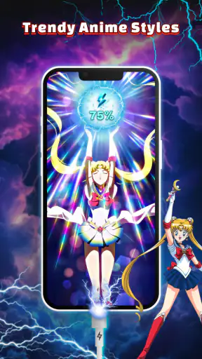
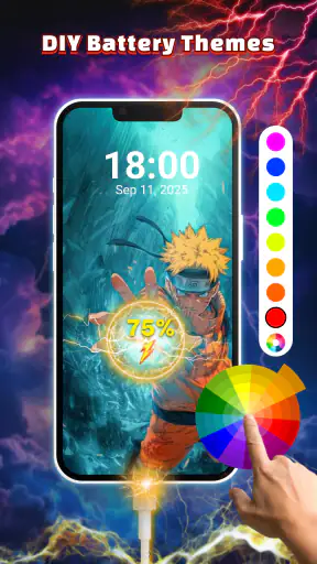
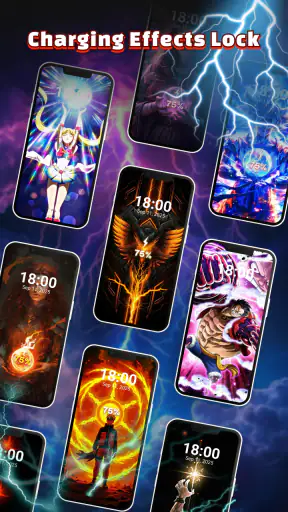
I installed Live 3D Charging Animation from Neli Creative to see whether it could make the ordinary moment of plugging in a phone feel more personal. This free personalization app focuses on animated charging visuals and custom live wallpapers, with a clear emphasis on appearance rather than battery management. My overall impression is that it works best as a small visual upgrade: enjoyable when you want your phone to feel less generic, but not essential if you prefer a quiet, distraction-free screen.
The app has a broad audience on paper. It is rated for Everyone, runs on Android 9 and later, and has passed the one-million-install mark. Its average score sits at 4.1 from roughly a thousand ratings, with about 33 written reviews, so there is enough public interest to show that the concept appeals to many users, while still leaving room for individual testing before making it part of your daily setup.
From a plain charging screen to a more personal setup
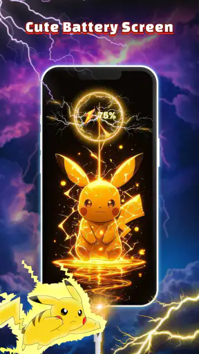
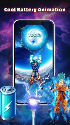
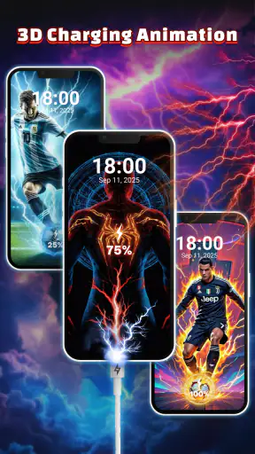
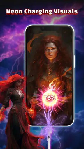
The starting condition is simple: you connect your phone to a charger and normally see the standard system response. That response is useful, but visually forgettable. This app changes the mood of that handoff by placing a 3D charging animation and a more decorative presentation around the charging moment. It is aimed at people who notice their lock screen, wallpaper, icons, and other visual details and want those elements to feel coordinated.
I would not treat it as a replacement for Android’s battery tools. It does not turn charging into a diagnostic dashboard in the way a dedicated battery utility might. The attraction is the visual layer. That distinction matters because it sets a realistic expectation: you are installing it for atmosphere, customization, and a more noticeable charging cue, not for deeper battery health information.
The first useful decision is to choose where the effect belongs in your routine. If your phone spends most of the night on a bedside charger, a calm animation can make the setup feel more intentional. If you plug in frequently during work, school, or travel, a more dramatic effect may become repetitive. I found the app easier to appreciate when I treated the animation as an accent rather than something that needed to command attention every time.
Choosing the right moment for the effect
A realistic everyday scenario is charging at a desk while moving between tasks. I connect the phone before a meeting, glance at the screen to confirm that the cable is working, and then leave it alone. In that situation, the animation has a practical visual role: it gives the charging event a distinct identity without requiring me to open a battery page. At night, the same effect can be pleasant, but a bright or busy design may be less suitable than a restrained wallpaper and a darker room.
That is one of the app’s less obvious trade-offs. A visual effect can make charging easier to notice, yet the same visibility can become a distraction. I recommend deciding whether your priority is confirmation, decoration, or both. For confirmation, a simple animation is enough. For decoration, you can spend more time matching the wallpaper and charging style to your phone’s overall theme.
The app’s store summary highlights 4K charging animation and custom live wallpapers. I read that as a promise of visual detail, not as a reason to assume every phone will display the same result. Screen size, resolution, manufacturer software, and the way Android handles overlays can all affect how polished the final presentation feels. The best approach is to judge the effect on your own device rather than relying on the label alone.
Building the setup step by step
My recommended workflow starts with the wallpaper, not the charging animation. The wallpaper is the part you see throughout the day, so it should establish the visual tone. A highly detailed live background paired with an equally busy charging effect can make the screen feel crowded. A simpler background gives the charging animation more room to stand out when the phone is connected.
Once the background feels right, I would test the charging screen in the situations where it will actually appear. Connect the phone at a desk, then try the same setup in a darker room. Look at whether the colors remain comfortable, whether important lock-screen information is still easy to read, and whether the animation feels like a useful confirmation or just another moving element. This small test prevents the common mistake of choosing a design because it looks impressive in a preview and then finding it tiring in everyday use.
The 3D presentation is most effective when it supports the device rather than competing with it. If your phone already has a colorful case or a strong home-screen theme, a restrained charging style may produce a more finished result. If the rest of the interface is plain, the animation can carry more personality. I see this as the app’s strongest creative opportunity: it lets you tune the charging moment to the phone you already use instead of treating it as a separate decoration.
Another practical tip is to change one visual element at a time. Start with a wallpaper, test it for a day, and then adjust the charging animation. If you alter everything at once, it becomes difficult to tell which choice improved the experience and which one made it less comfortable. This matters especially for users who care about readability, because motion and contrast can affect how quickly you find the clock or notifications.
What happens when the phone changes hands
The first handoff is between the app and Android’s personalization system. The application has to fit into the phone’s existing handling of wallpapers, lock screens, charging states, and background activity. That means the final appearance is not created by the app alone. The operating system and the phone manufacturer’s interface also influence what you see and when you see it.
This is where expectations should remain practical. A setup that looks smooth during one charging session may behave differently after a system change, a restart, or a switch between charging locations. I would check the result after installing the wallpaper and again after reconnecting the charger later, rather than assuming that selecting an option completes the entire job. The most important handoff is the one from selection to real use.
The second handoff is from the charging animation to your attention. A visual effect should tell you that the phone has entered a charging state and then get out of the way. If you find yourself waiting to watch it, the design is probably too dominant for your routine. This is particularly relevant for people who charge briefly throughout the day and need to put the phone down immediately.
The third handoff concerns other people who may use the device. A playful animation can be a nice personal touch, but a shared family phone or a work device may benefit from something more neutral. The app is strongest on a personal phone where the owner controls the visual language. It is less convincing when the device needs to look consistent and unobtrusive for several users.
How the result compares with ordinary alternatives
The usual alternative is to keep the default charging screen and customize only the wallpaper. That option is simpler and usually better for someone who wants minimal setup. It also keeps the phone’s visual behavior close to the manufacturer’s design, which can feel more coherent if you already like the default interface.
Another alternative is a static wallpaper. Static images do not add motion, so they are less expressive, but they also tend to be easier on the eye and less likely to make the screen feel active when you are trying to ignore the phone. If your main goal is a clean home screen, the live wallpaper portion may not justify the extra visual movement.
Dedicated battery applications are a different comparison altogether. They are preferable when you want charging history, battery condition information, or technical monitoring. Live 3D Charging Animation is not the choice I would make for those needs. Its value is immediate and visual: it changes how charging looks, not how much battery information you can analyze.
Compared with manually searching for separate wallpaper and animation tools, the advantage here is convenience and a more unified purpose. The compromise is that the experience is centered on a particular style of customization. If you want fine control over every system element, a broader launcher or theming solution may offer more depth. If you simply want a decorative charging moment without building a theme from several unrelated tools, this app is easier to understand.
Where the workflow can break
The first possible friction is visual fatigue. A design that feels exciting on the first day may become background noise after repeated charging sessions. I would be especially cautious with bright colors, constant motion, or high-contrast effects if the phone is used beside the bed. The app can improve the experience only when the chosen style matches the frequency and setting of your charging routine.
The second issue is that “custom” does not automatically mean “infinitely adjustable.” The app’s appeal comes from choosing a look that suits you, but users who expect professional-level theme editing may find the process more curated than fully open-ended. That is not a flaw for casual personalization; it is simply an important distinction for people who want to design every detail themselves.
The third concern is compatibility in the broad everyday sense. Android 9 support makes the app available to many devices, but Android versions and manufacturer interfaces do not always present personalization features identically. If the charging effect does not appear exactly as expected, I would first revisit the selected wallpaper and charging presentation, then reconnect the phone and test again. A restart can also be a sensible troubleshooting step for any visual customization that does not immediately settle into place.
There is also a battery-related judgment to make. Live wallpapers and animated visuals are inherently more active than a static image, so users who are extremely careful about every source of screen activity may prefer the default setup. I would not install this app on a phone where battery conservation is the overriding priority. The visual benefit is discretionary, and that makes it easy to skip when efficiency matters more than style.
Who will get the most from it
I think the app suits people who enjoy changing their phone’s appearance without committing to a complete launcher overhaul. It is a good fit for someone who wants charging to feel more personal, for users who like live wallpapers, and for anyone who enjoys matching the phone’s screen to a case, room, or personal mood.
It can also work well for a teenager or family member who wants a more expressive device while staying within an Everyone-rated app category. The free price lowers the barrier to trying it, which is useful when you are unsure whether animated charging visuals will become part of your routine or merely provide a brief novelty.
I would skip it if you want technical battery tools, a completely static interface, or a phone that should remain visually neutral. I would also choose a more comprehensive theming tool if your goal is to redesign icons, menus, widgets, and system colors together. This app has a narrower purpose, and that focus is both its strength and its limitation.
Version, access, and the practical verdict
The current release is version 2.2.0, and the app remains free to try. With support beginning at Android 9, the compatibility range is useful for many existing phones, though the final appearance still depends on the device’s own software behavior. I would install it with a clear plan: choose one wallpaper, test one charging style, and keep the setup only if it remains pleasant after the novelty fades.
My final result is positive but measured. Live 3D Charging Animation gives an otherwise routine action a recognizable visual identity, and its combination of animated charging effects with live wallpapers makes sense for users who care about a coordinated phone experience. The best outcome comes from restraint: use a background that preserves readability, select an animation that fits your charging environment, and avoid treating every available visual effect as something that must be enabled.
My recommendation is simple: try it if you want personality at the moment your phone connects to power, but choose another kind of app if your priority is battery analysis, maximum control, or minimal motion. Neli Creative has made a focused personalization tool rather than an all-purpose phone utility, and that clarity makes it easy to decide whether the visual change belongs in your own daily workflow.


